Brand identity
WhoYou
- Industry
- Digital identity and biometrics
- Services
- Brand identity, Logo redraw, Product brand system, Imagery and iconography
- Location
- South Africa
01 Introduction
WhoYou verifies identity for South Africa's banks, insurers and fast-growing platforms. It runs four products under one name. We drew its mark from the one thing nobody else has, and built a system that keeps a security company warm.
02 The position
No two are the same
True of a fingerprint, and of the company.
The competition had bigger budgets, so the brand had to earn attention another way.
WhoYou verifies identity for South African banks, insurers and fast-growing platforms, against global competitors with far deeper pockets. The product was strong and the old brand did not say so, which kept awareness and inbound leads low. We built the new identity from a loop fingerprint, because no two are alike, and that is both the mark and the reason the product exists. Four products now run under one name, each with its own colour.
03 The idea
A loop fingerprint is a set of nested U's.
The mark started on paper with a loop print. Lift two of its ridges, join them with one continuous stroke, and they spell the U in WhoYou. No two prints are the same, which is the whole point of the product.

04 The redraw
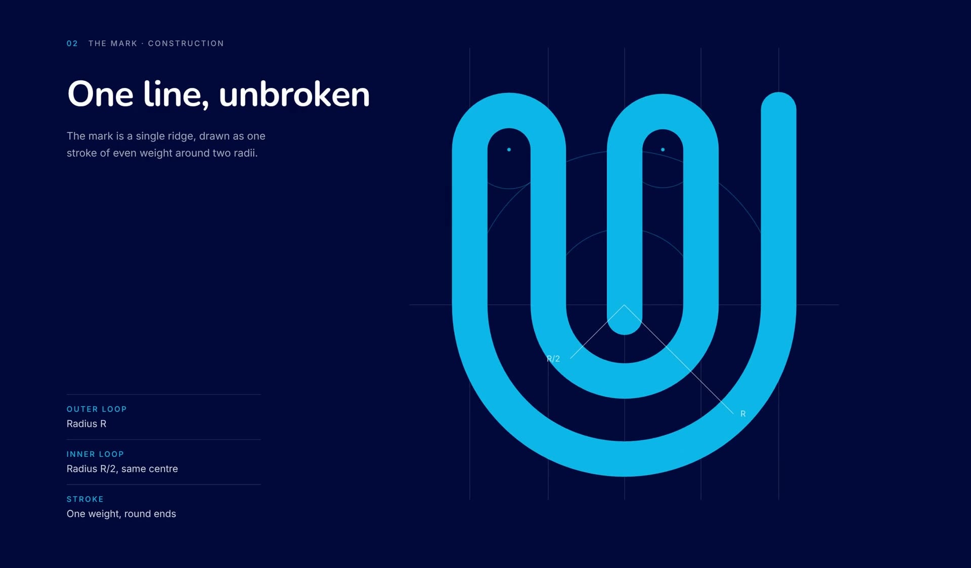
We rebuilt the mark as true geometry.
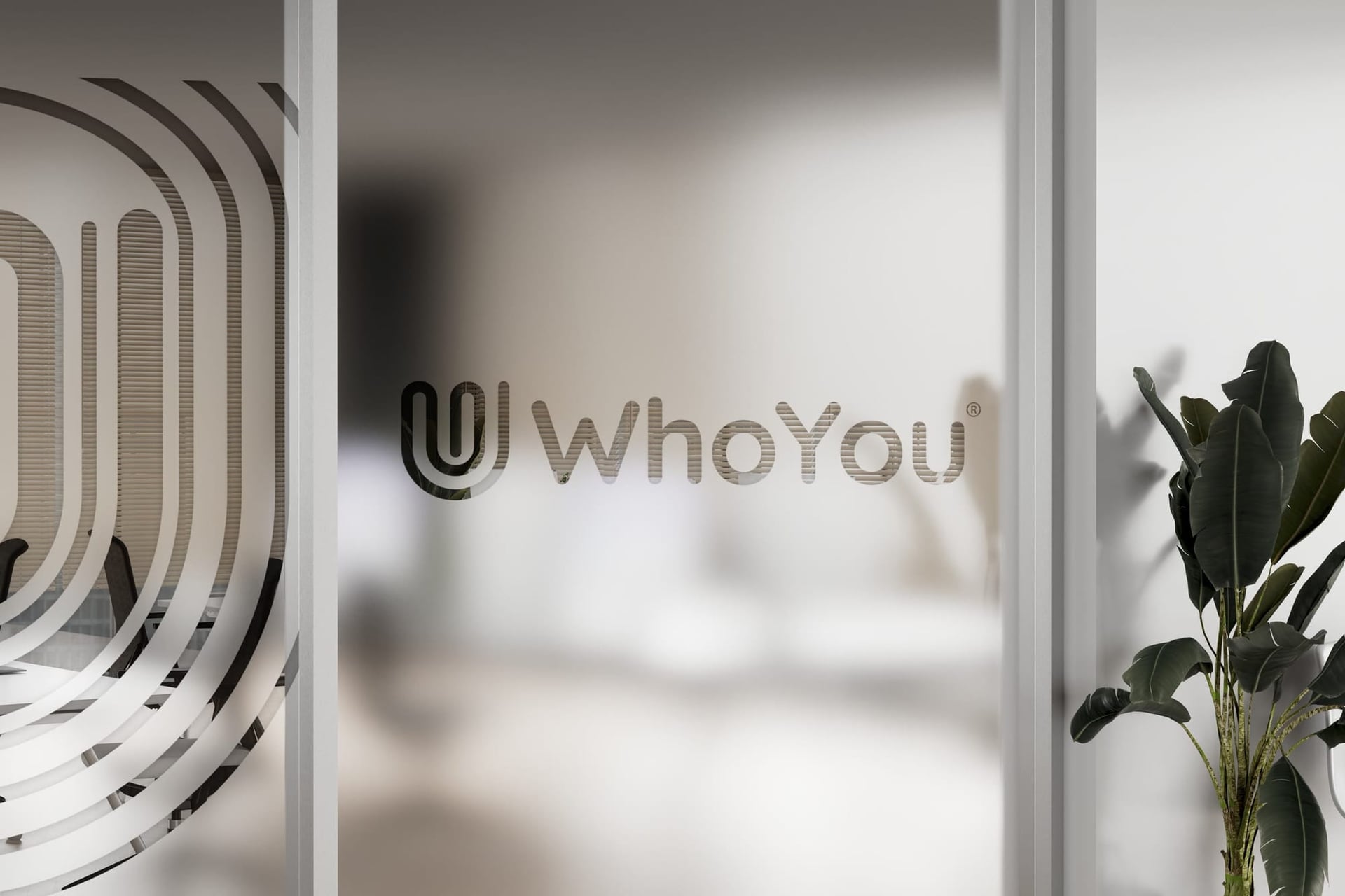
The original icon was a trace that ran past its own artboard, so its loops and ends were sliced flat and its stroke weight wandered. We redrew it with one stroke weight and round ends, sized to the same box, so it stays crisp from an app icon to a lanyard.

05 Colour and type
Calm blue, with one colour for each product.
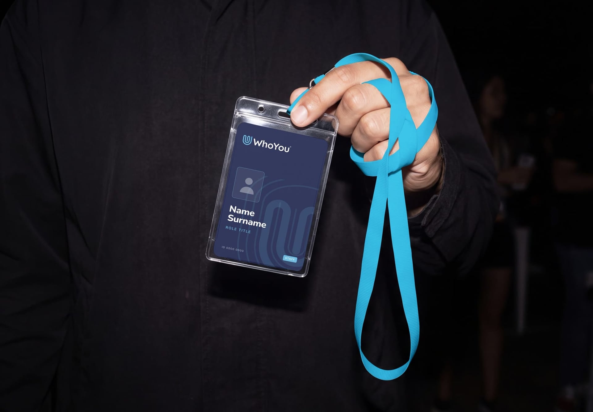
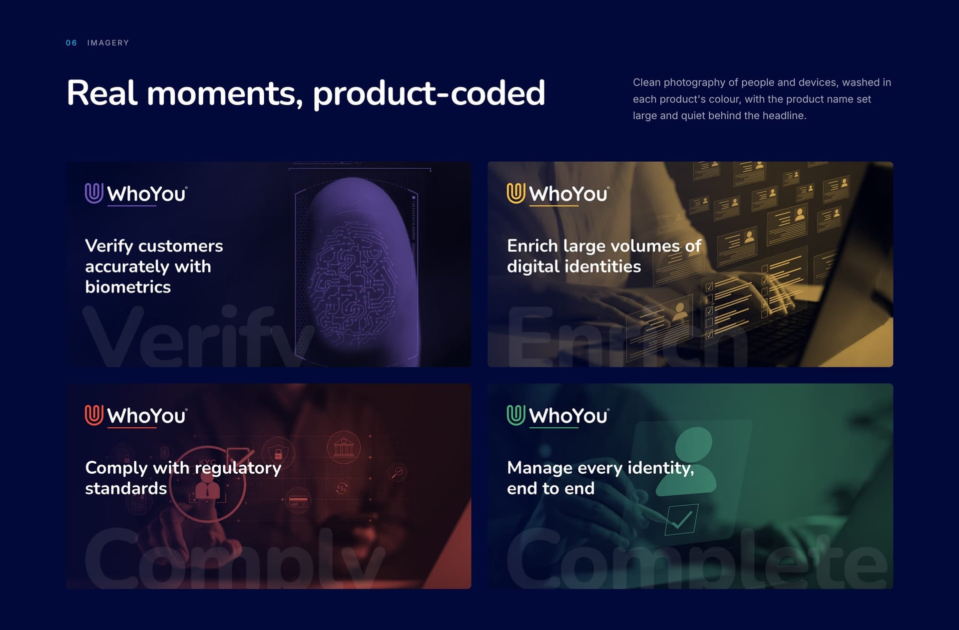
Identity Blue leads and Deep Blue grounds it. Verify, Enrich, Comply and Complete each get a single colour, used only on their icon and underline, so customers can tell them apart at a glance. Nunito's rounded terminals match the mark's round ends and keep the tone friendly. Inter does the heavy lifting in data, dashboards and long reads.
Identity Blue
Deep Blue
Light Blue
Verify
Enrich
Comply
Complete
- Nunito
- Primary. Light to Black, headlines and UI
- Inter
- Secondary. Data, dashboards and long reads

06 Imagery
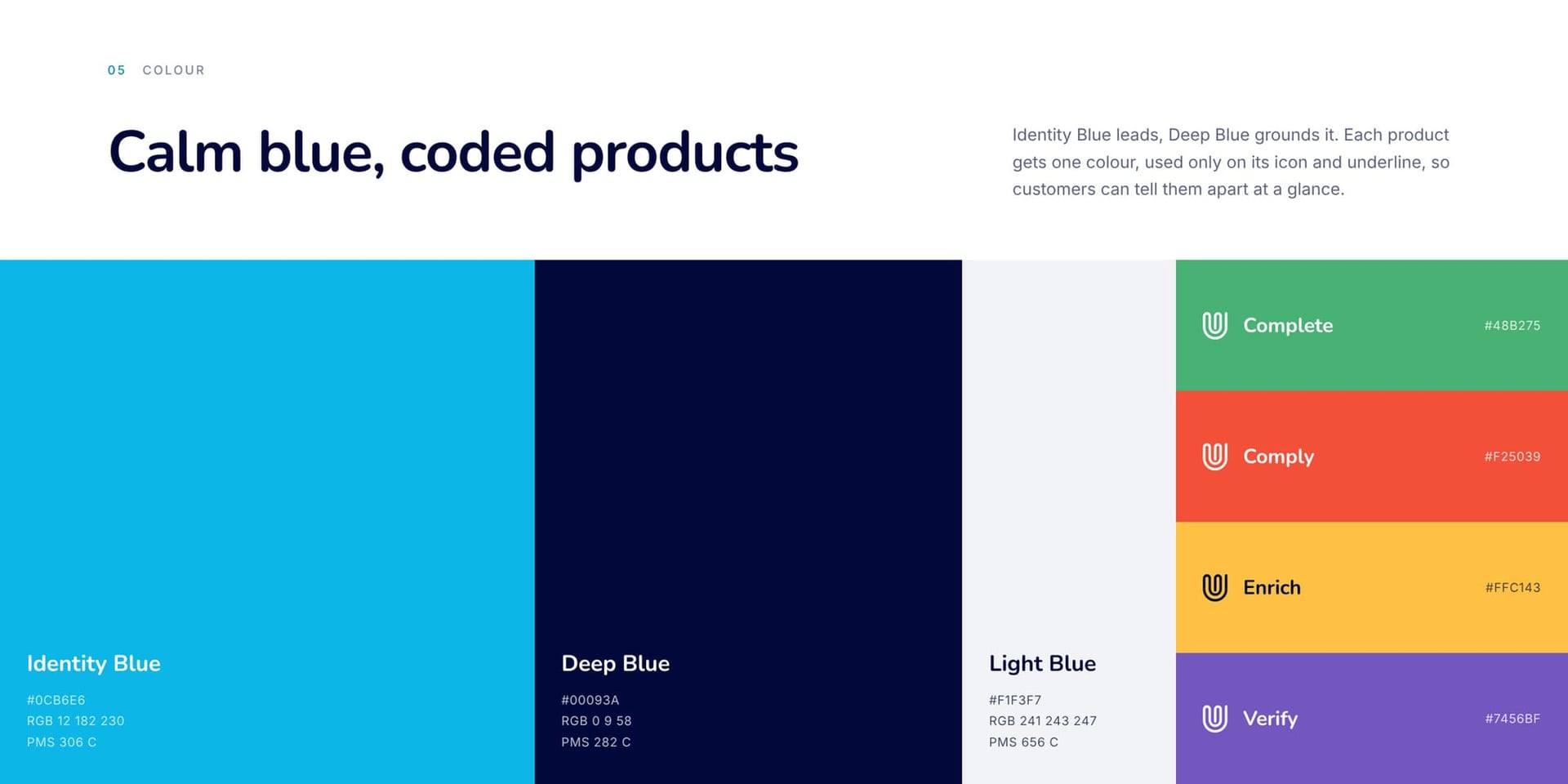
Real people, washed in the colour of their product.
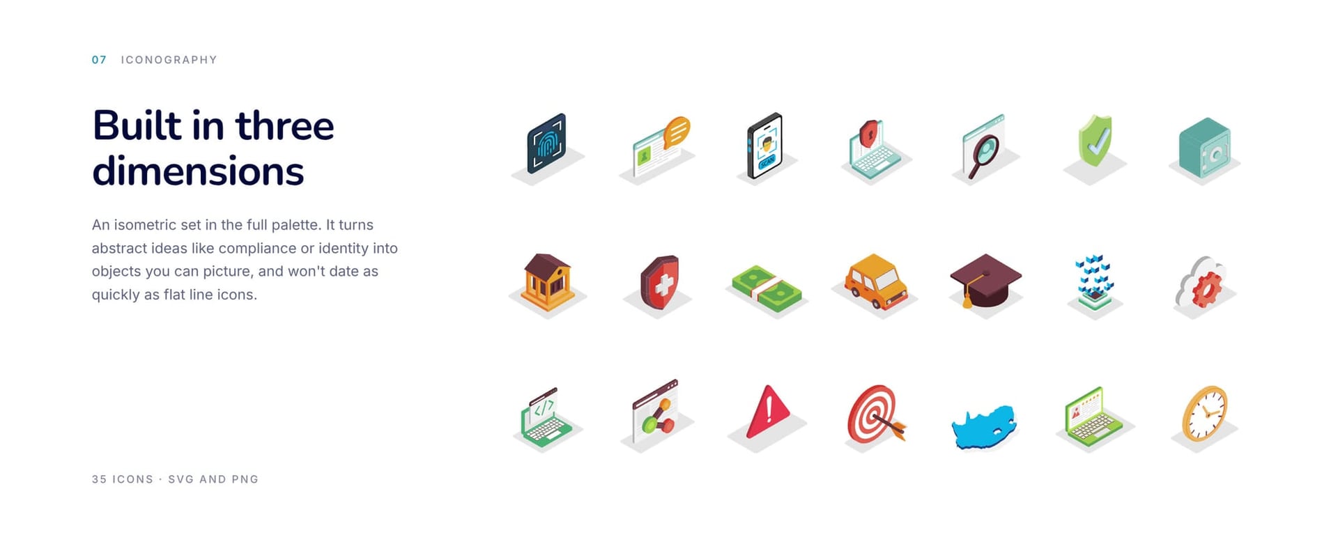
Photography shows people and devices in ordinary moments, tinted in each product's colour with its name set large and quiet behind the headline. A set of 35 isometric icons turns abstract ideas like compliance and identity into objects you can picture.
07 In the world
Four products read as one company.
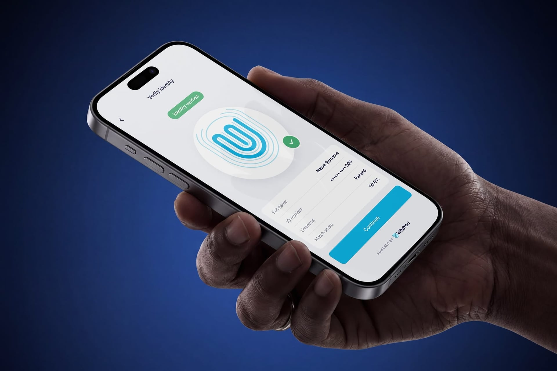
The system runs from product screens to the business card in your wallet. Every touchpoint uses the same blue and the same stroke, so each product is recognisably WhoYou.


08 Impact
The mark is drawn from the thing WhoYou verifies.
Each new product slots into the system with its own colour, its own icon and the same continuous line.
What we did
- Brand identity
- Logo redraw
- Product brand system
- Photography direction
- Iconography

Next case study
Moxii Africa
A new name and a drumbeat for truth across Africa