
Brand identity
Decentral Energy
- Industry
- Solar energy
- Services
- Brand identity, Logo and motion, Visual system, Brand applications
- Year
- 2025
- Location
- South Africa
01 Introduction
Decentral Energy designs, installs, finances and maintains solar for South African businesses, and has done since 2009. We built their identity from the thing they build, starting with a single solar cell.

02 The position
Powering growth
The promise the whole system answers to.
It reads two ways, and Decentral means both.
Decentral has been putting solar on South African businesses since 2009. By the time they came to us the identity had fragmented, and the market around them had filled up with companies selling the same panels. Businesses buy solar to cut their costs and make room to expand, so we built the brand on that double meaning: the electricity Decentral supplies, and the growth it pays for. Every decision that follows answers to it.
03 The idea
We reduced a solar farm to its smallest working part.
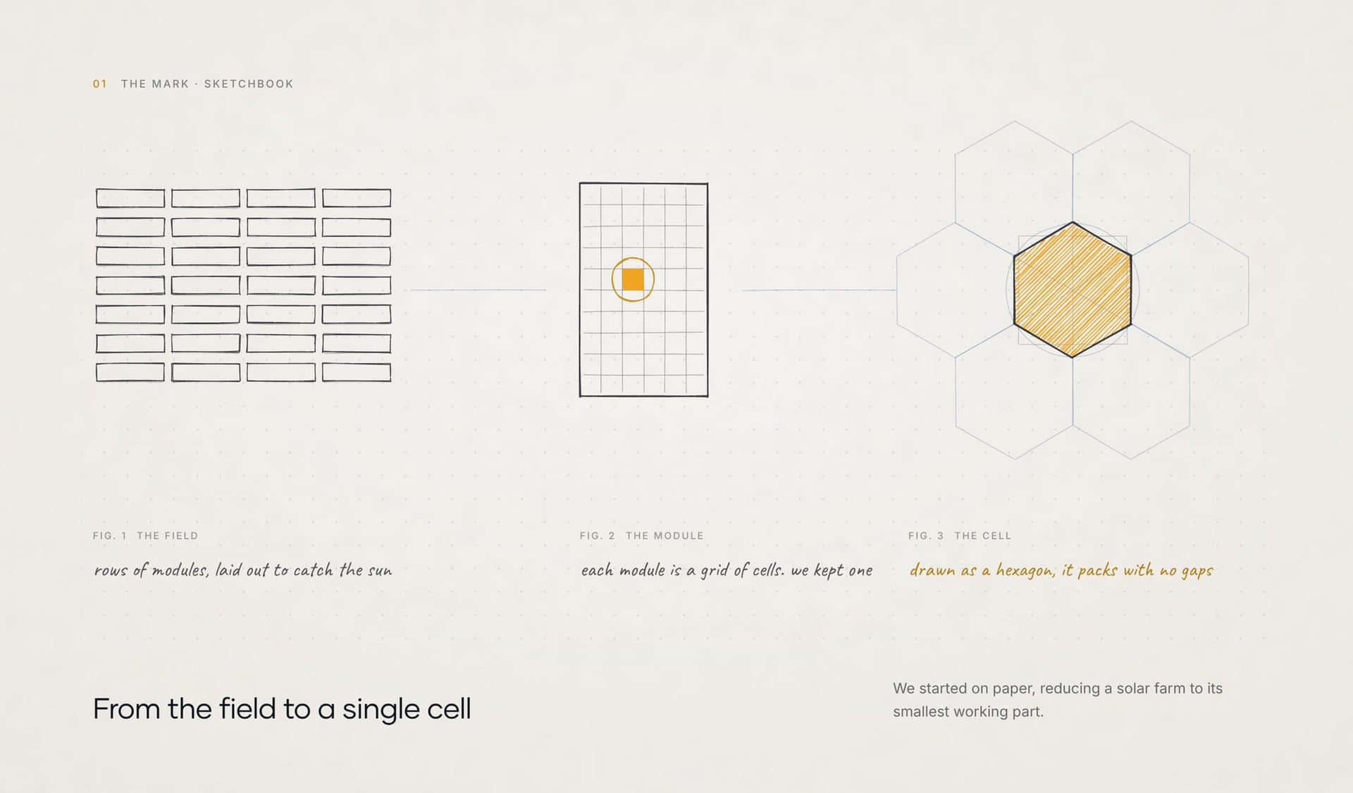
We started on paper. A solar farm is rows of modules laid out to catch the sun, and every module is a grid of cells. We kept one cell and drew it as a hexagon, because hexagons pack together with no gaps. That single shape went on to become the mark, the pattern and the frame for every photograph.

04 The mark
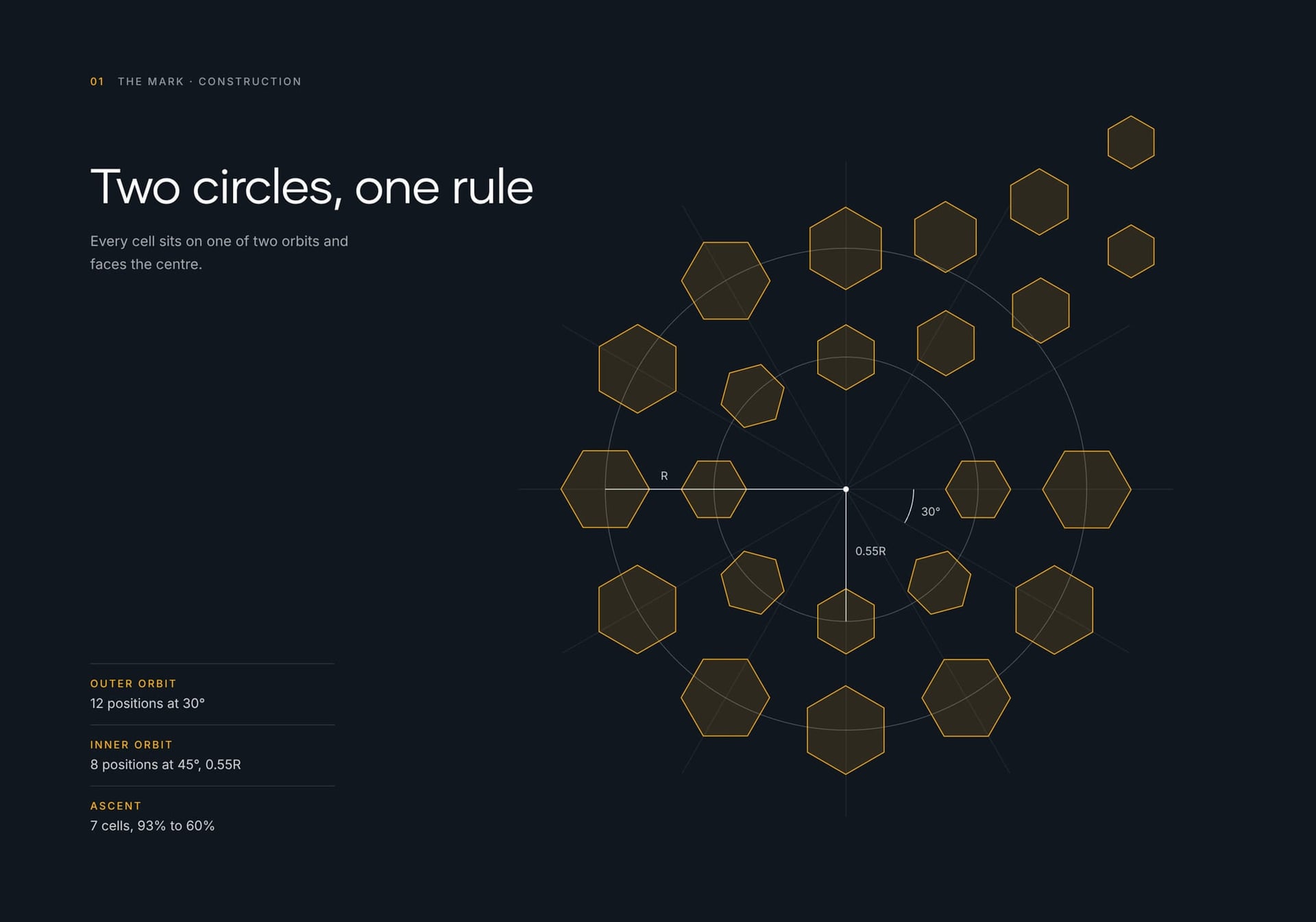
Twenty-three cells turn to face a single centre.
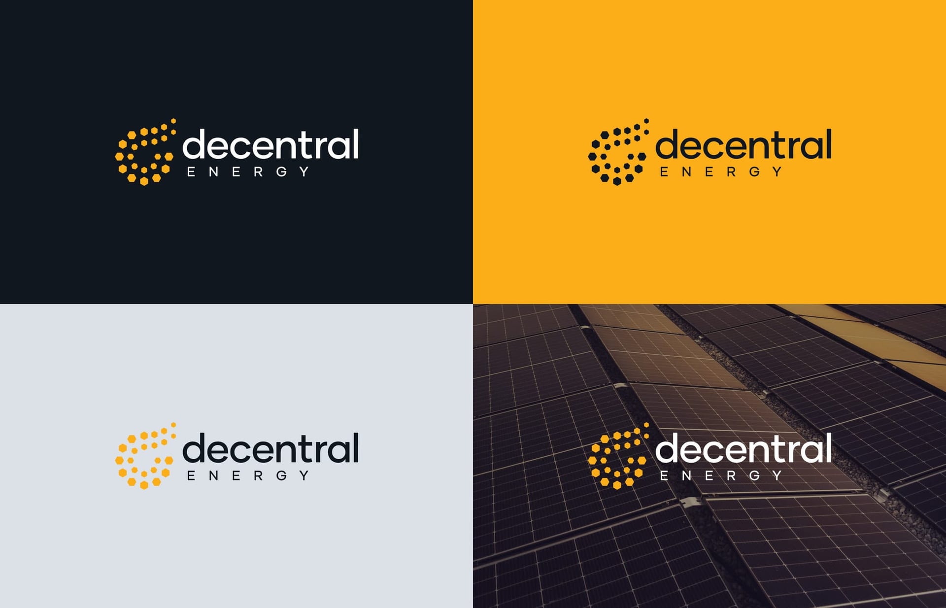
Every cell sits on one of two orbits and turns a corner toward the middle, the way a panel angles to the light. At the top the orbit opens and seven cells lift away, getting smaller as they rise. Read as a whole, the circle becomes a d, and the mark shows energy on the move.



05 Colour and type
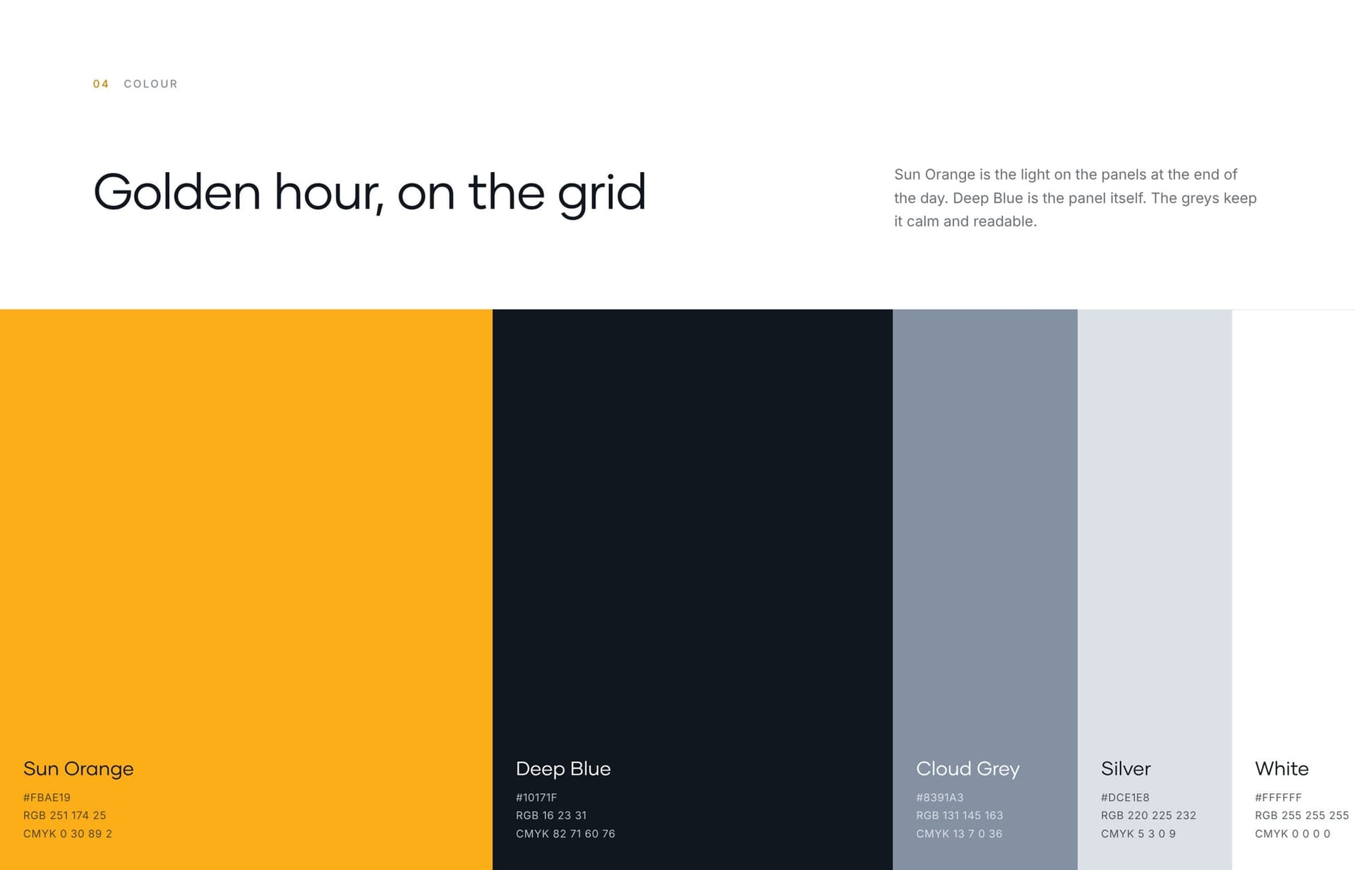
Sun Orange is the light on the panels at golden hour.
Deep Blue is the panel itself, and Cloud Grey and Silver keep everything calm and readable. Gilmer sets the wordmark because it is built on near-perfect circles with almost no stroke contrast, so the type and the cells look drawn by the same hand. Inter handles data and long reads.
Sun Orange
Deep Blue
Cloud Grey
Silver
- Gilmer
- Primary. Wordmark, headlines, Regular and Medium
- Inter
- Secondary. Data and long reads


06 The window
Every hexagon opens onto the farm.
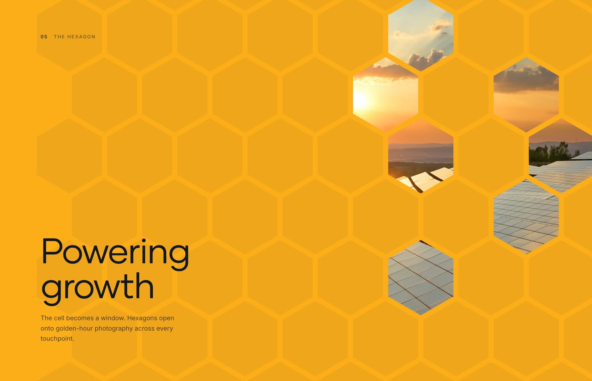
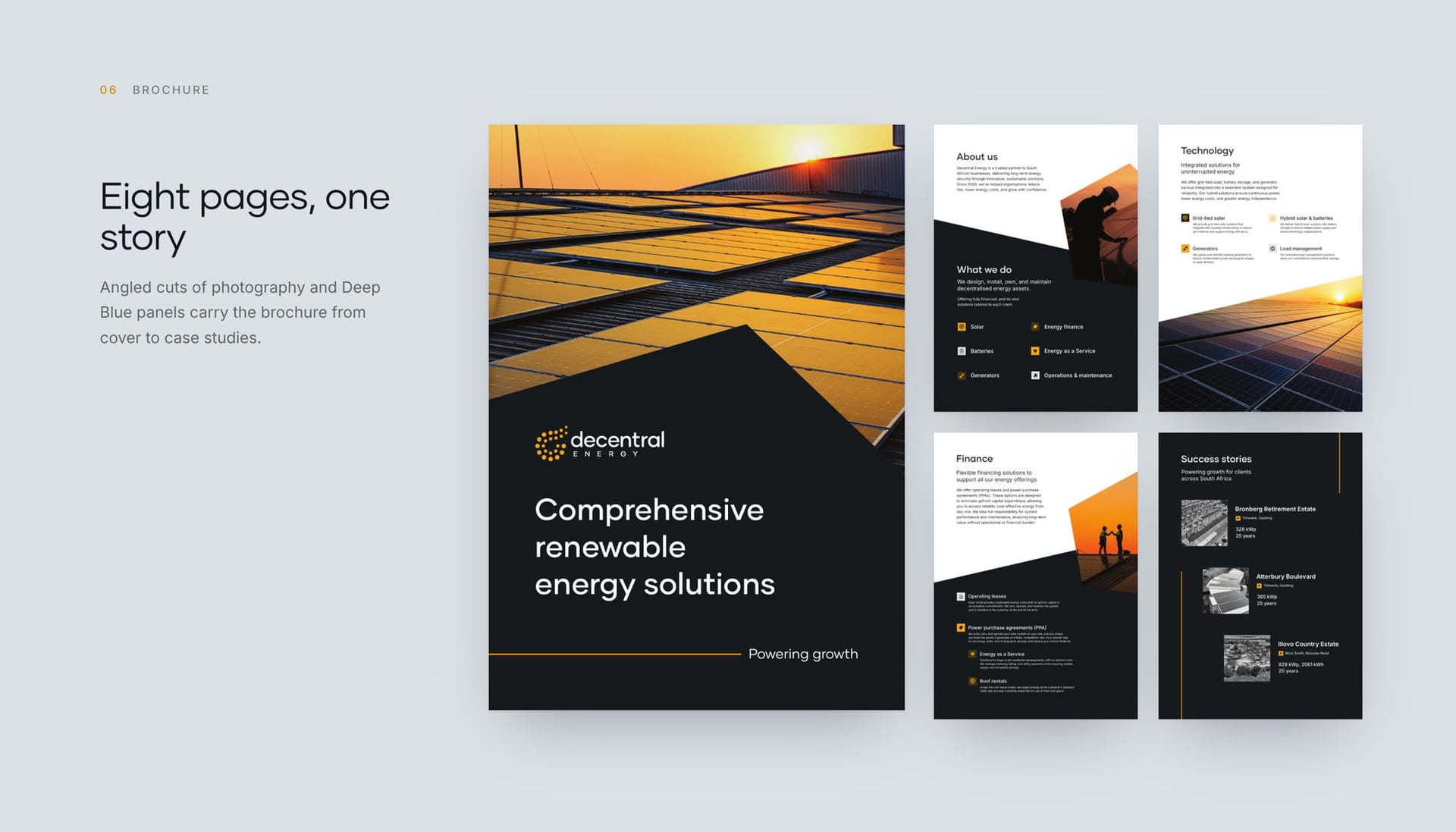
The cell also works as a window. Hexagons crop golden-hour photography of real installs, so every layout carries a piece of the work. The same device runs through an eight-page brochure and a LinkedIn carousel built for every new installation.


07 In the world
The system holds up at full height.
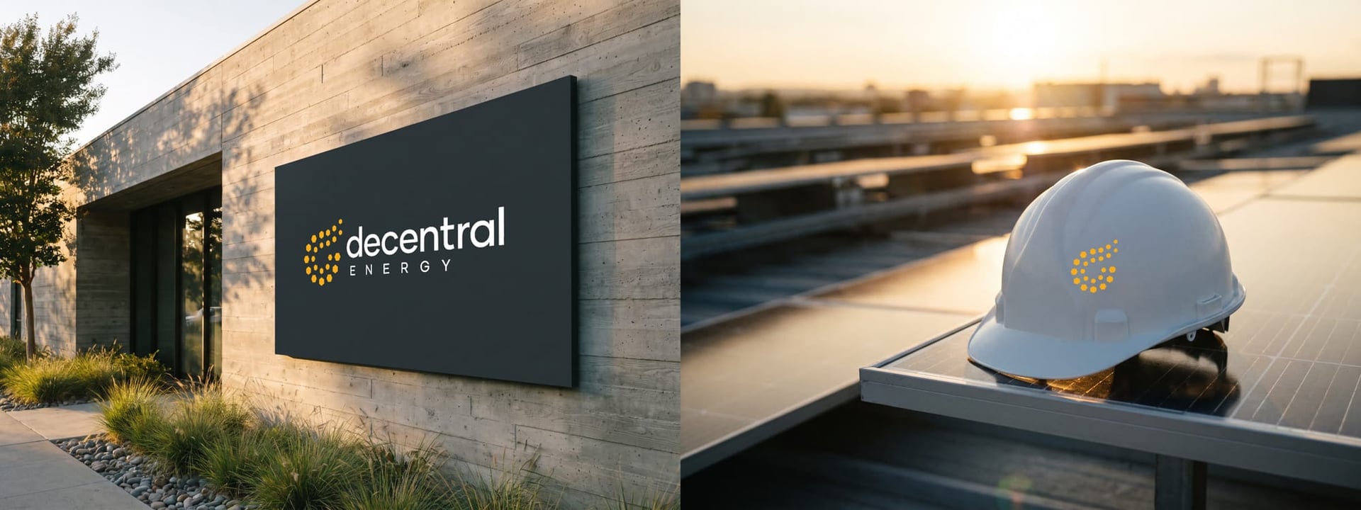
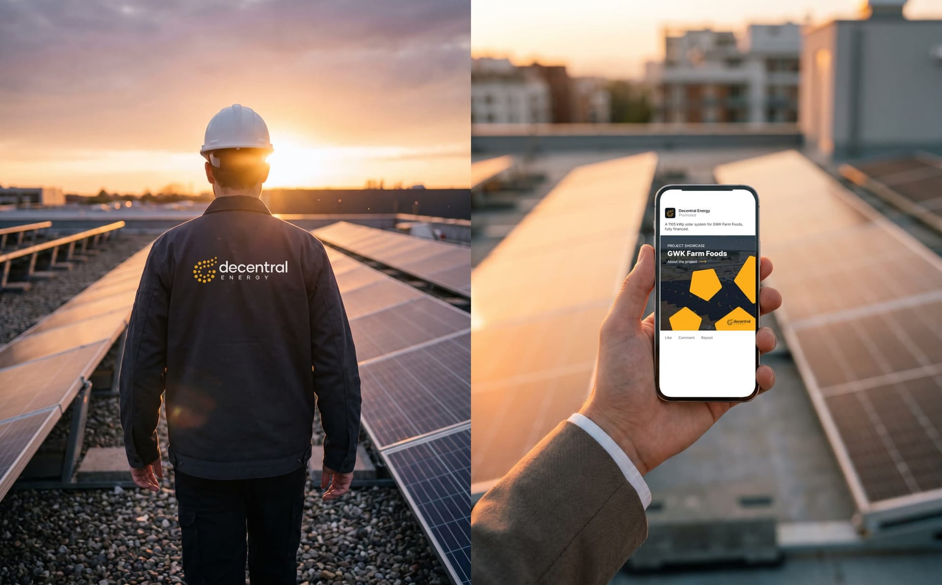
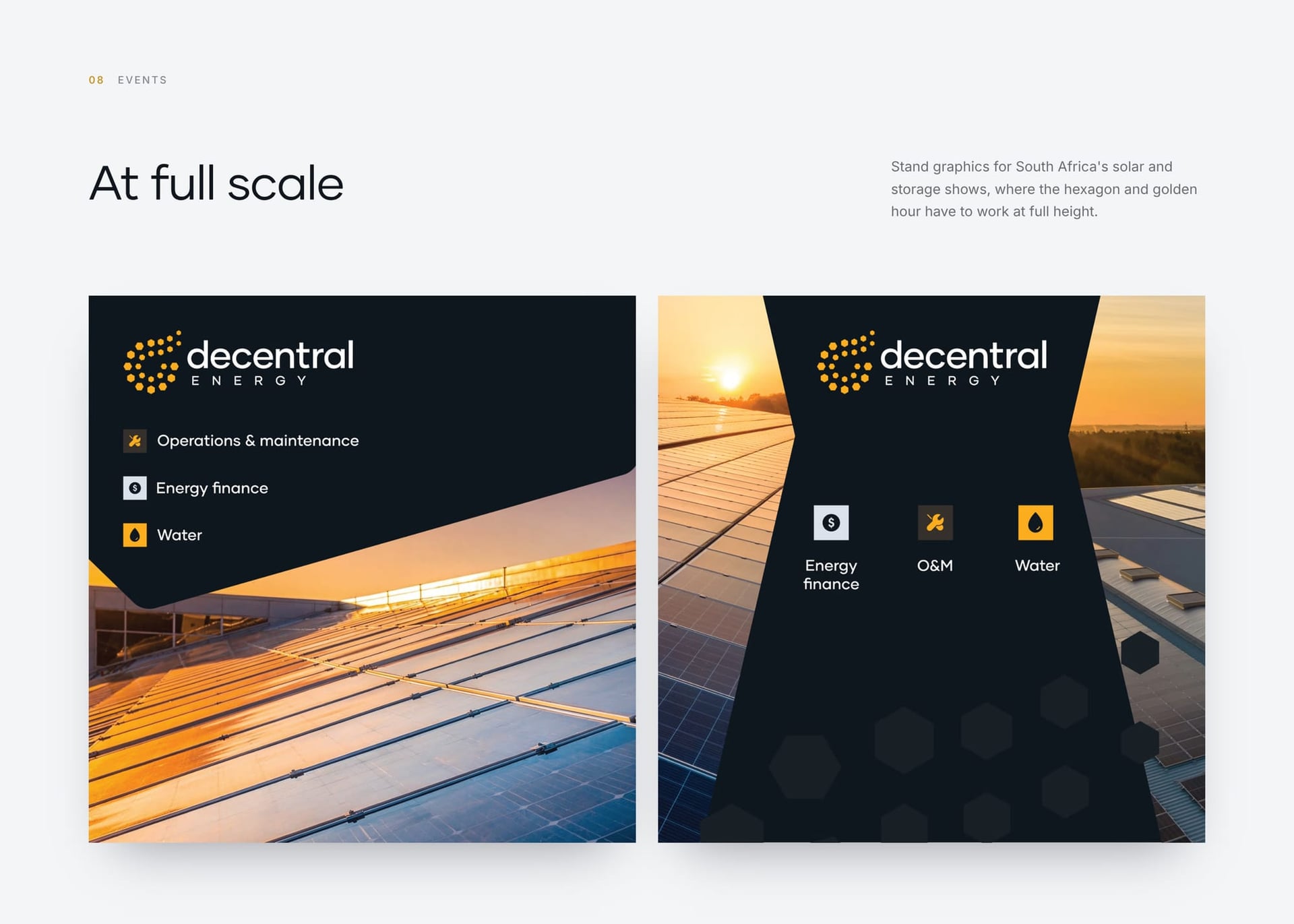
We pushed the system onto install vans, site hoardings, stand graphics, reception walls and a hard hat, so every surface reads as the same company.




08 Impact
The brand became the front of a marketing engine.
It anchors everything Decentral puts out, and it fronts the marketing engine we built alongside it, which lifted inbound leads by 50%.
What we did
- Brand identity
- Logo animation
- Visual system
- Print, outdoor and digital applications

Next case study
WhoYou
A mark traced from a fingerprint