Brand and product identity
Code Capsules
- Industry
- Cloud platform
- Services
- Brand identity, Design system, Illustration, Product and motion
- Location
- South Africa
01 Introduction
Code Capsules is one of the only platform-as-a-service companies built in Africa. Push to git and your app is built, deployed and scaled on infrastructure in Africa, Europe and the US, with SSL, databases and logs handled for you. More than 5,000 developers deploy on it. We built a brand that stays quiet and lets the product do the talking.
02 The position
Don't just host. Deploy.
Code Capsules' own line.
Code Capsules had the technology and was selling it to the wrong buyer.
It is one of the only platform-as-a-service companies built in Africa, and more than 5,000 developers deploy on it. The B2C model was not converting and the messaging did not land with enterprise buyers, so we moved the positioning to B2B and rebuilt the value proposition around it. The brand that came out of that stays quiet and lets the product talk.
03 The mark
The mark is eleven nodes and capsules wired into one container.
Separate services deployed together is the shape of an app on Code Capsules, so we made it the logo. Nodes, capsules and connections sit on one construction grid. The mark works as a full lockup, an app icon and a favicon.


04 Colour and type
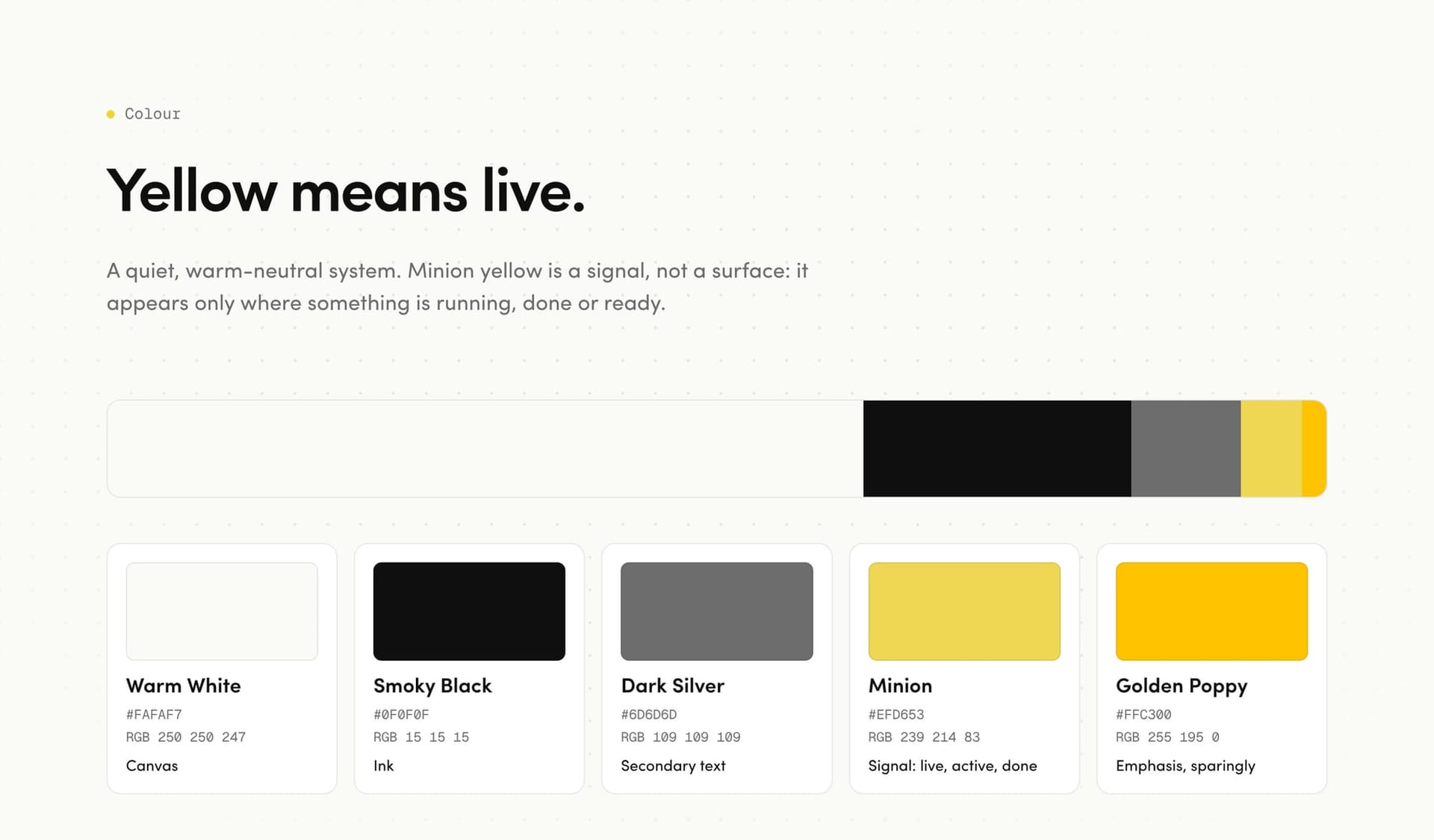
Yellow means live.
The system runs on warm white and Smoky Black. Minion yellow is kept as a signal and only appears where something is running, done or ready, so the brand and the product speak the same language. Sofia Pro is geometric and friendly, Futura PT handles labels and figures, and code is always set in monospace.
Warm White
Smoky Black
Dark Silver
Minion Yellow
Golden Poppy
- Sofia Pro
- Primary. Geometric and friendly
- Futura PT
- Secondary. Labels and figures
- Monospace
- Code, always

05 Illustration
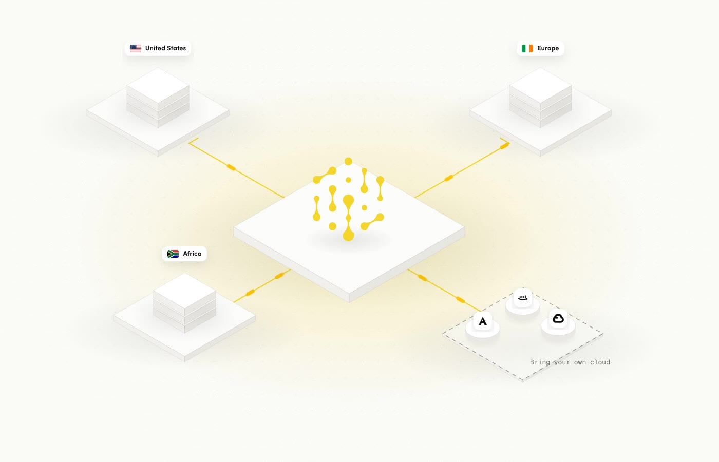
An isometric world that shows how the platform works.
We built an isometric illustration language for the platform. Code moves from GitHub onto the platform and out to Next, React, Vue and Svelte. One platform reaches the US, Europe and Africa, and customers can bring their own cloud on AWS, GCP or Azure.

06 Product
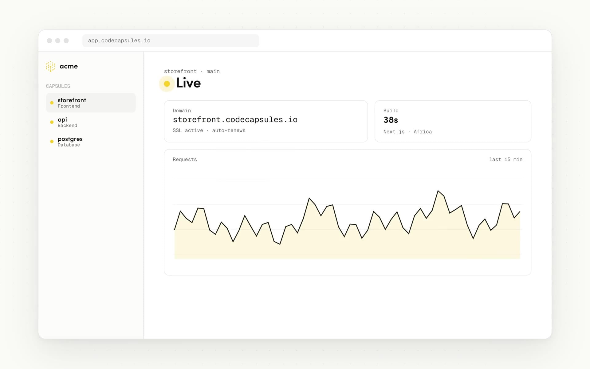
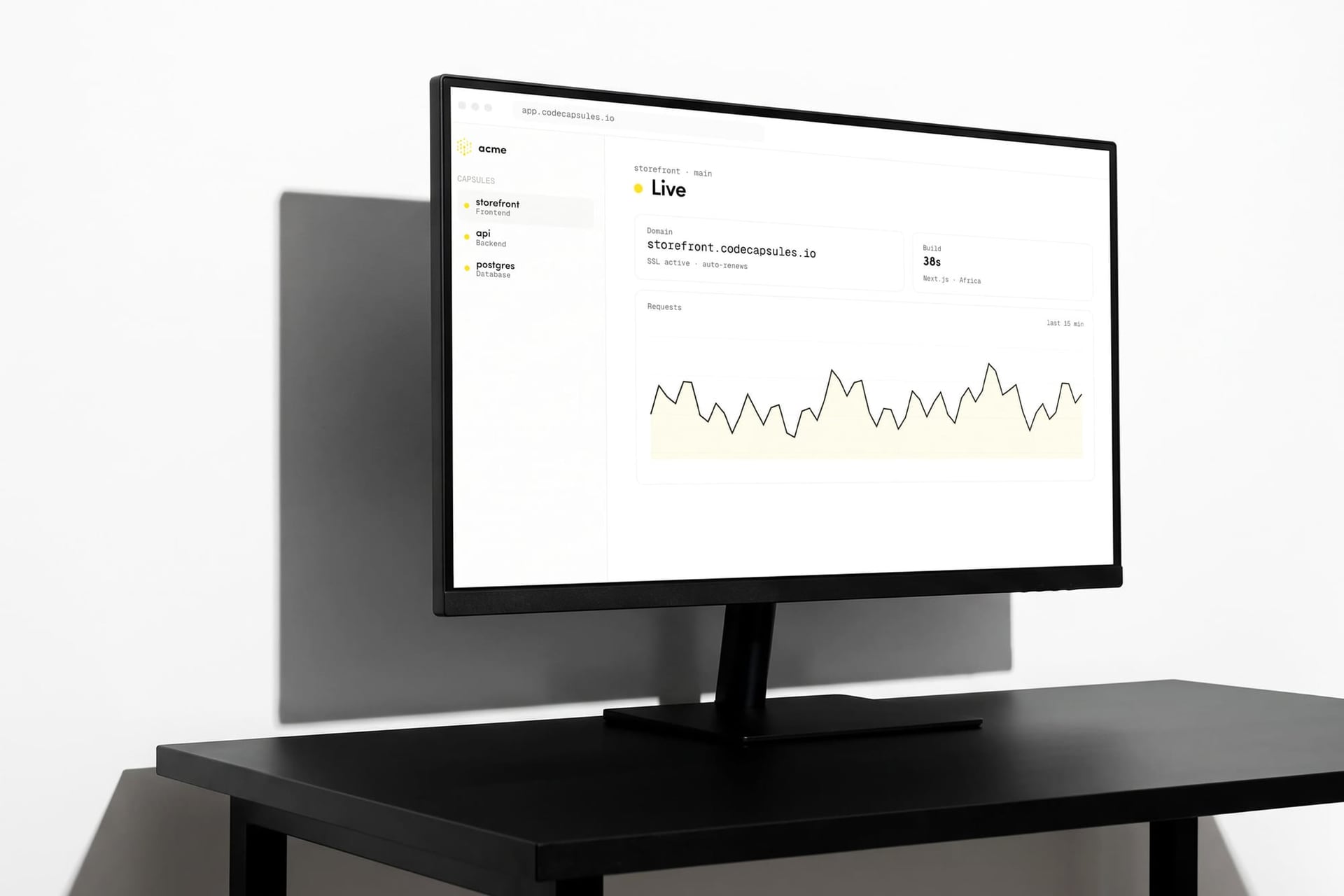
The dashboard carries the brand as much as the logo does.
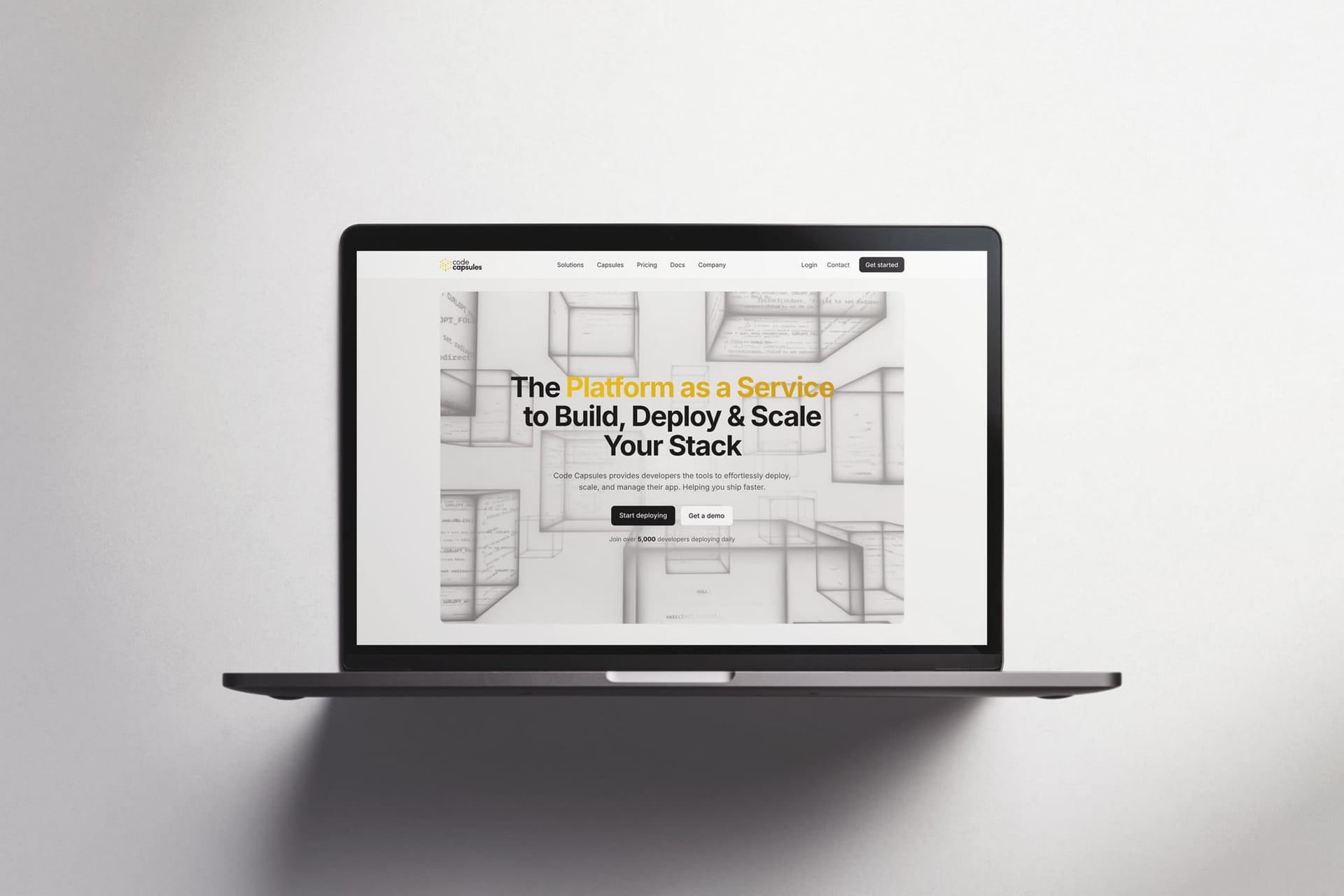
We rebuilt the core flow in the brand's own language. You pick a repo, press Deploy, watch the build logs and land on a live screen with your domain, SSL and metrics. Glass capsules carry the same idea onto the homepage.
07 In the world
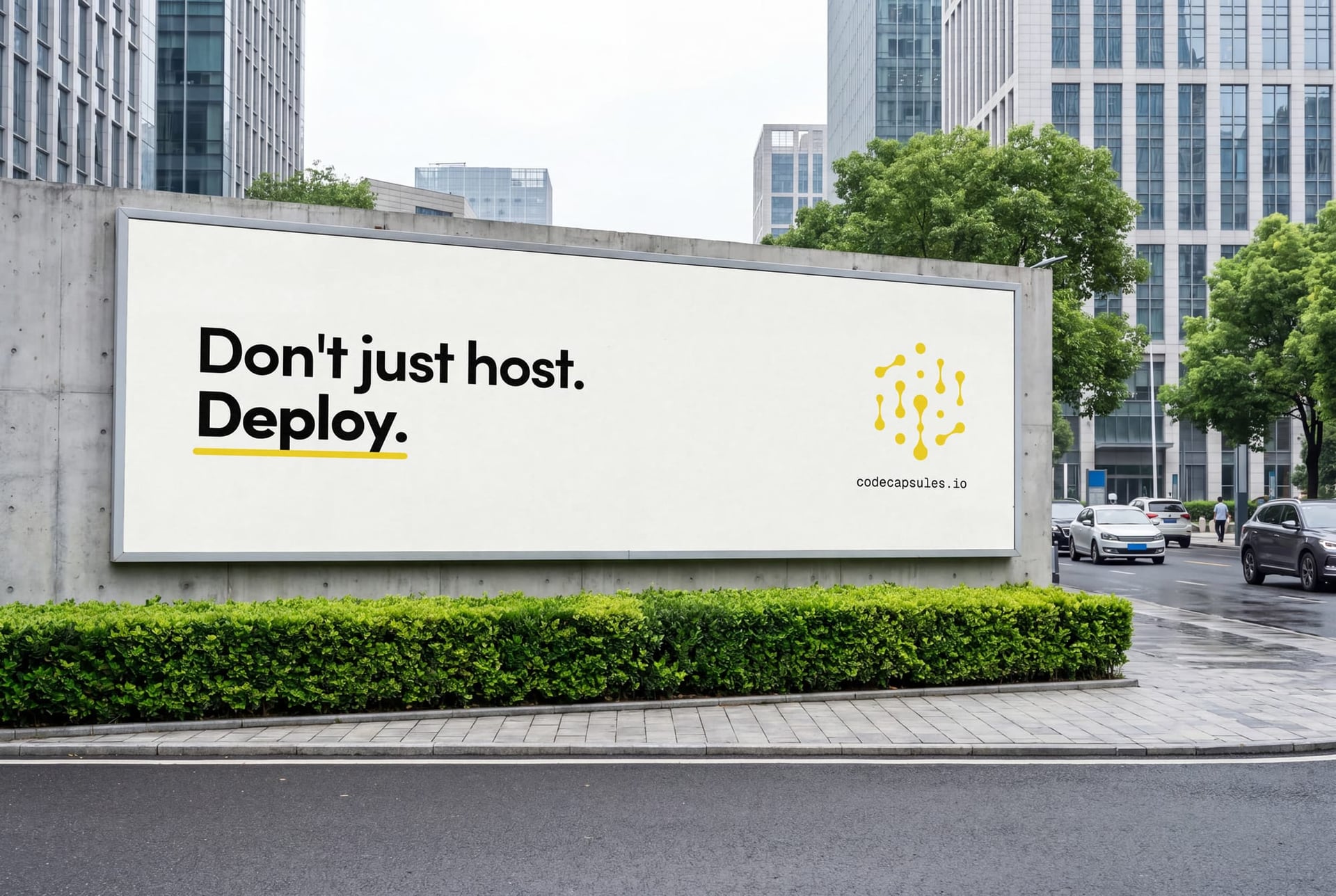
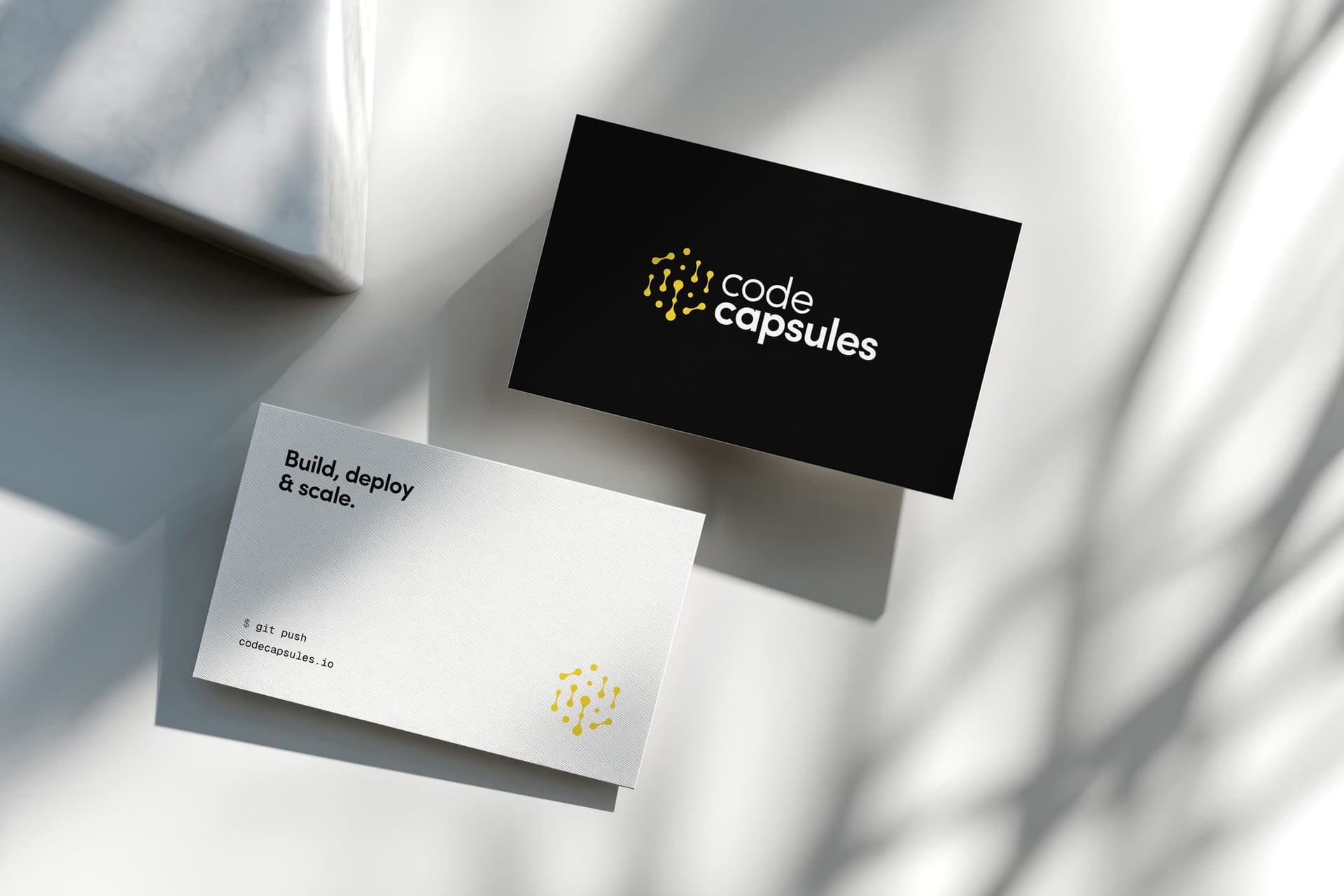
The line runs from the billboard to the business card.
The brand line, “Don't just host. Deploy.”, works at street scale as well as on a card. The Free Frontend launch film shows the system in motion, exactly as it was released.
08 Impact
One system runs from the homepage to the dashboard.
The same mark, colours and illustration run through the homepage, the dashboard, the launch films and the billboard, so the brand and the product feel like one thing.
What we did
- Brand identity
- Design system
- Illustration
- Product design
- Motion

Next case study
Cascade
A name and a mark where one letter flows into the next