
Brand and corporate identity
AVA
- Industry
- Mining technology
- Services
- Brand identity, Corporate identity, Image treatment, Iconography and motion
- Year
- 2025
- Location
- South Africa
01 Introduction
AVA builds data-driven mine management software for mines, quarries and contractors, across three products: Load & Haul, Allocate and Pit 2 Port. We created the original brand, and in 2025 we rebuilt the corporate identity around one idea. AVA lives between the physical mine and its data, so the brand should too.

02 The position
Between the mine and its data
Where AVA actually sits.
AVA sells technology into an industry that does not look like technology.
AVA builds mine management software for mines, quarries and contractors, across Load & Haul, Allocate and Pit 2 Port. We made the original brand, and by 2025 it read like the industry around it rather than like the software it sells. The rebuild put one idea at the centre: everything AVA does turns activity on a mine into data someone can act on, so every photograph now carries the real world and its digital twin in the same frame.
03 The mark
The logo is two data points and the line that connects them.
Everything AVA does turns activity on a mine into data you can act on. Two points enter from opposite sides, meet and draw a line, and the letters open up and down from it.

04 Colour and type
AVA is blue in an industry of brown and yellow.
The primary blues set AVA apart from competitors in traditional mining tones and put technology first. A secondary palette handles UI states and reporting. Instrument Sans is precise and mechanical with a little warmth, set in Regular, Medium and Bold.
AVA Dark Blue
AVA Medium Blue
AVA Blue
Coal
Silver
Green
Red
Yellow
- Instrument Sans
- Primary. Regular, Medium and Bold
- Calibri
- Fallback inside Microsoft Office


05 The split
Every photograph is split into its digital twin.
We cut out the subject and keep it physical and in full colour. Behind it, the world is desaturated, split with AVA Dark Blue and laid over with a wave pattern. The same frame shows the real truck and its data at once, and any photo the team takes can join the system in four steps.


06 Shapes and data
The brand shapes run like a machine.
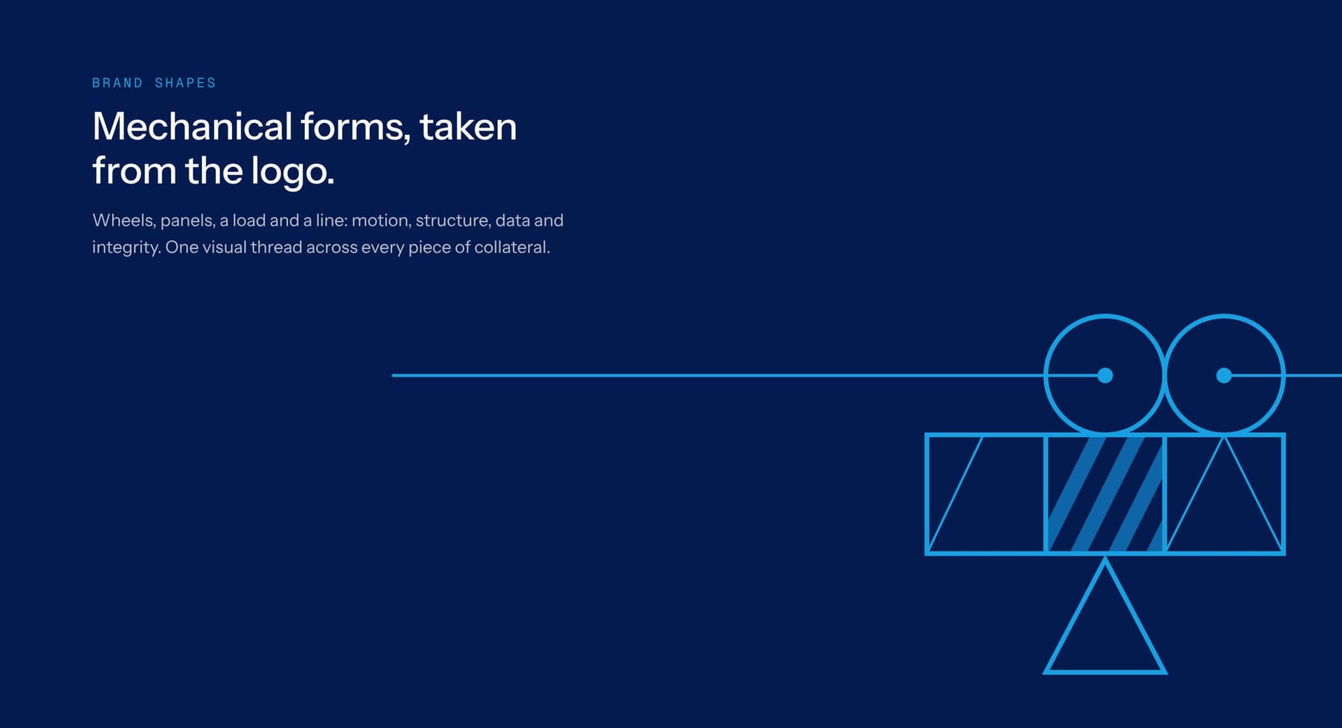
Wheels, panels, a load and a line come straight from the logo and stand for motion, structure, data and integrity. In motion they assemble from a single line, then carry into a second image language that draws live operations onto the mine. Haul routes fill with trucks, a stockpile gets surveyed and daily tonnes climb.


07 In the world
The identity works at street scale.
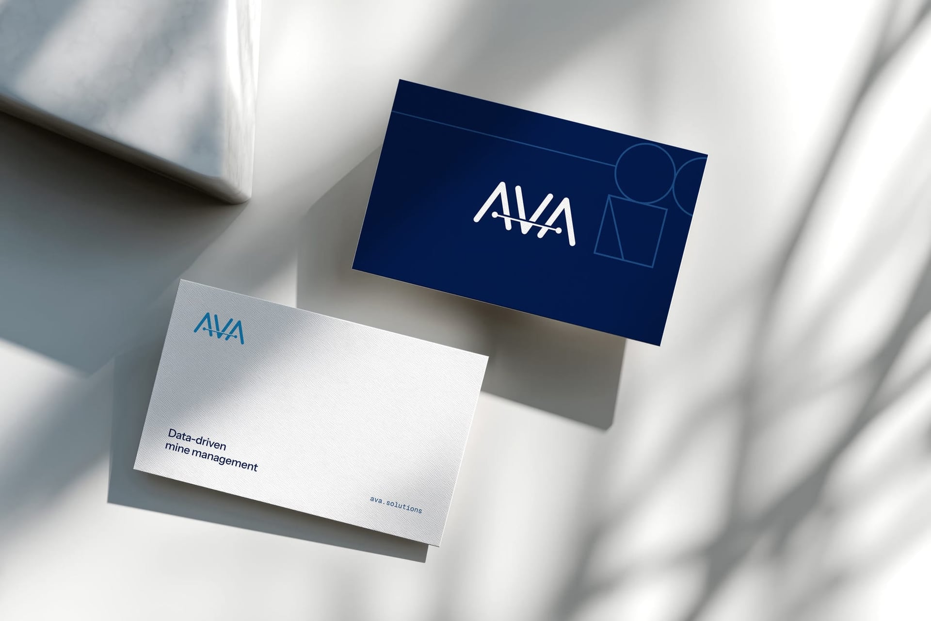
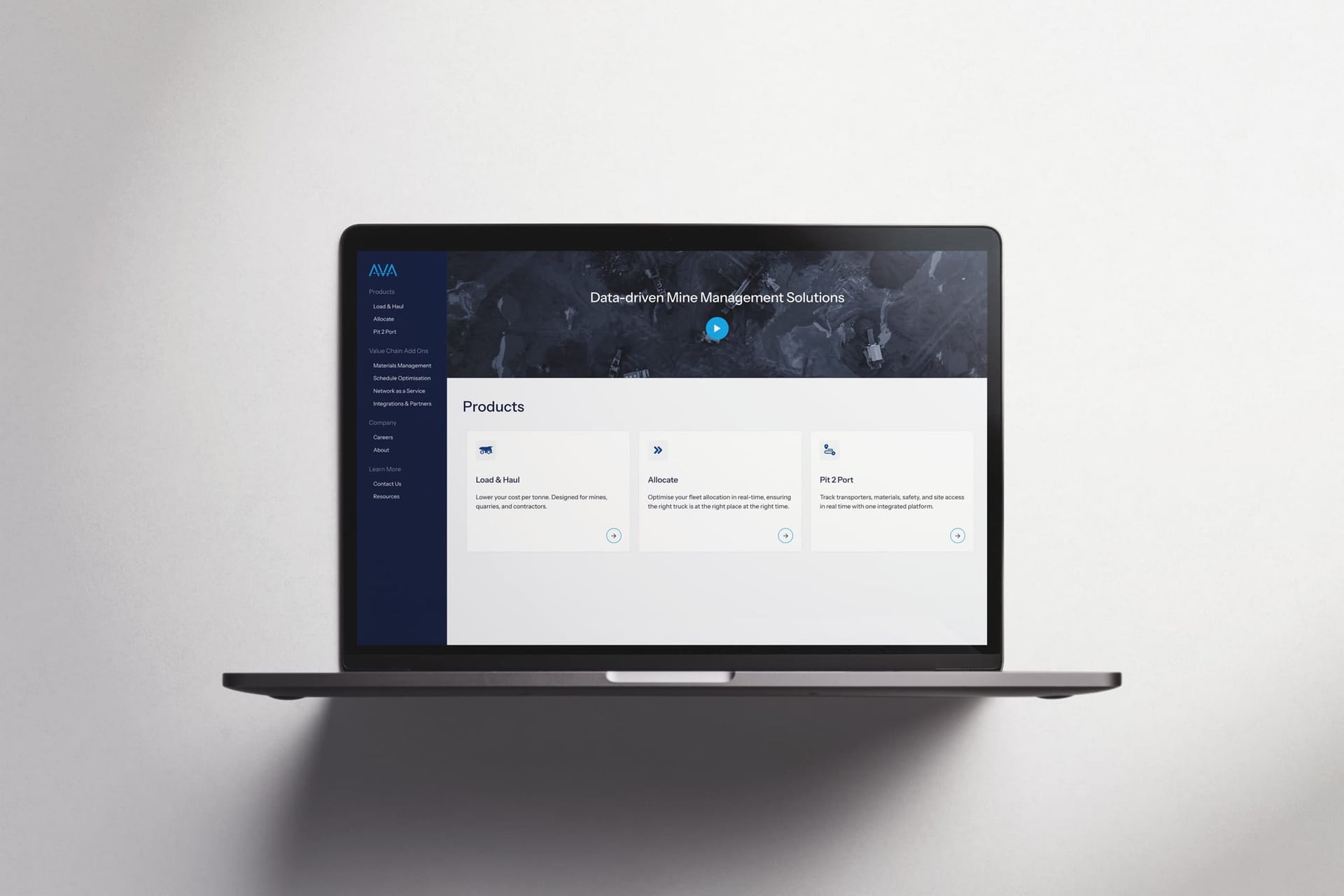
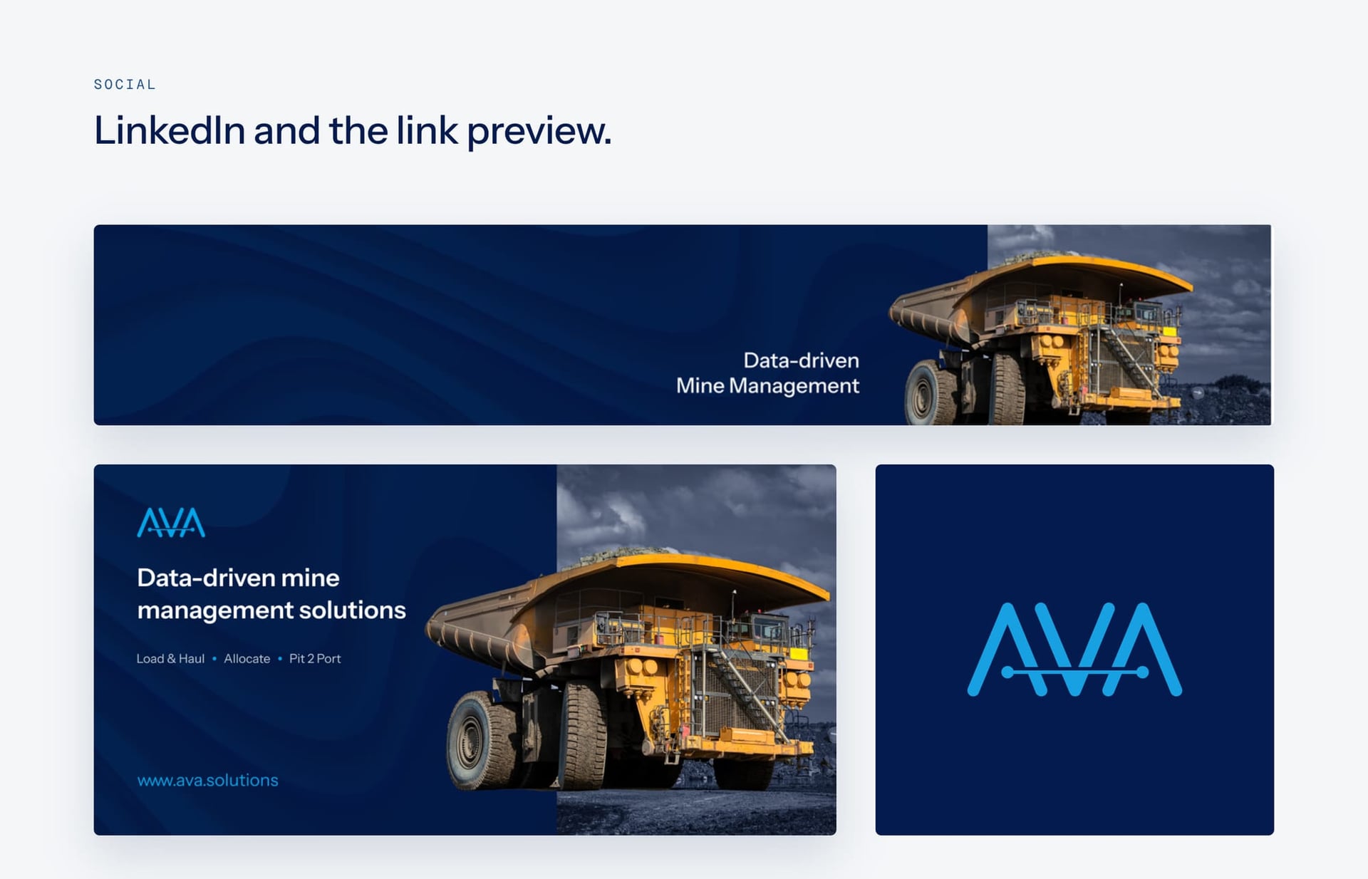
The system covers stationery, the website, social and outdoor, with the image treatment doing most of the work. On the billboard, “Every truck. Every tonne. Live.” runs beside a treated haul truck.

08 Impact
AVA now looks like the technology company it is.
With its blues and one image treatment, AVA's marketing looks like the software it sells. The whole brand idea fits in a single photograph.
What we did
- Brand identity
- Corporate identity
- Image treatment
- Iconography
- Stationery
- Motion

Next case study
Magix
The target in the logo became a lens